Creating Interactive Accordions using jQuery

Accordions are useful interface elements that, when clicked, will expand or condense the information on a web page. Named aptly after the accordion, an instrument that expands and condenses. You know the one I’m talking about, right?

Anyway, In this article I will provide examples on how to create accordions using jQuery, show a modified example of how to create accordions nested within accordions and explain when you might want to use accordions over a standard page layout.
For Developers – The Good Stuff
For any developers who have stumbled on here looking for a quick copy and paste job, see below for the finalised code for both the standard accordion and nested accordion code snippets.
See the Pen jQuery Accordions by Jonathan Dempsey (@jonathanedempsey) on CodePen.
See the Pen jQuery Nested Accordions by Jonathan Dempsey (@jonathanedempsey) on CodePen.
If you’re looking for a brief explanation of the code then read on!
Standard Accordions
See the Pen jQuery Accordions by Jonathan Dempsey (@jonathanedempsey) on CodePen.
In the snippet above we have the following:
- HTML markup: The markup is broken down into three main areas;
- We have a main accordion wrapper for each accordion (.accordion). Functionally we don’t typically need this but I like to have it available for styling purposes.
- The accordion title (.accordion__title) which is always shown, along with a plus icon. When the title is clicked then the accordion content will be opened, or closed if it was already open.
- The accordion content (.accordion__content) which is toggled open or closed whenever the accordion title is clicked.
- CSS: I have provided the minimum amount css needed to make the accordions work if you wish to start from scratch yourself. I have also provided additional CSS to show what can be possible when the correct styling is applied.
- jQuery applies a click event to each accordion. The jQuery click event then opens/closes the accordion content and adds/removes an active accordion class.
Nested Accordions
See the Pen jQuery Nested Accordions by Jonathan Dempsey (@jonathanedempsey) on CodePen.
The snippet for the nested accordions is similar to the standard accordion snippet but has a few crucial changes.
- HTML markup is the same as before apart from the nested accordions being added. Nested accordions are added into the content (.accordion__content) of their parent accordion.
- The CSS is also mostly the same as before. However, with old CSS we run into problems where styles from an active parent accordion will bleed down into inactive nested accordions. To combat this we use the > selector which we can use to select elements with a specific parent (The active class, .accordion–open).
- Again, jQuery is almost identical except we make use of the jQuery method .first(). This stops an active parent accordion from opening all of its nested accordion’s content too!
When might I want to use accordions
Using accordions saves your web page vertical space. Saving vertical space is not usually too much of a problem on desktop but when a user is on their phone, a paragraph that took up three lines on desktop now takes up eight on mobile.
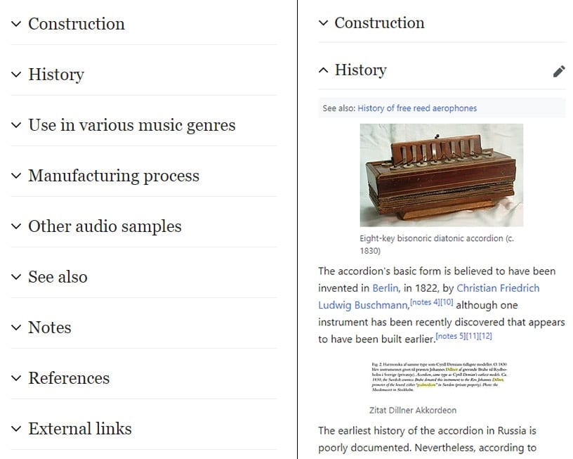
Wikipedia makes good use of accordions. On their desktop site all the content is displayed as normal.
However, when the site is visited on mobile, all sections after the introduction are split up into accordions. Using accordions on their mobile site saves users time having to scroll through reams of content and allows them to quickly scan the page for relevant information.

Accordions are also very useful on FAQ pages. This ensures that users can quickly scan the page for the questions that matter to them while hiding information that is irrelevant to them.
When should I avoid using accordions
When you decide to use an accordion, ask yourself this; “Is there enough content here to fit into its own page?” If the answer is yes, then don’t use an accordion. One of the main disadvantages of accordions is that it can easily disorientate the user.
This is especially so when the user clicks into an accordion and suddenly the entire script of Hamlet appears on their page. Keep your hidden content short and concise.

Don’t hide critical content behind an accordion. If the goal of a web page is to show the user the price of a service then that information should always be visible. Hiding important content behind an accordion ensures that not every user will see that content unless they actively click to open it.
Continue Reading
-

Friday wins much coveted Best Website Award at the Spiders
Our award-winning team here at Friday are proud to announce that we have won the much-coveted ‘Best Website’ Award at the annual Spider Awards.
-

Next-gen Images: Page Speed’s New Best Friend
Converting your images to a next-gen image format, like WebP, is one of the best ways to improve the user’s experience and page speed on your website.
-

CodePen Challenge: Handling User-Uploaded Images
In this week's Challenge, we start with a set of very different user-uploaded avatars and it's our job to do something with them to bring them together nicely.
-

Using robots.txt to prevent staging sites from indexing
Going over the basics of the robots.txt and the solution to prevent your staging site from being indexed.


